Unlock the Power of Colour: 10 Must-Know Colour Schemes for a Stunning Home Makeover
Colour is integral to our everyday lives, influencing our emotions, perceptions, and preferences. In interior design, the importance of colour cannot be overstated. A well-chosen colour scheme can make a room feel warm and inviting, create a calming atmosphere, or provide a dramatic backdrop for your favourite pieces of art. Ultimately, the right colour scheme can transform a living space, elevating it from ordinary to extraordinary.
As an expert in interior design, I can attest to the transformative power of colour in creating stunning and inviting homes. In this comprehensive guide, I will introduce you to 10 must-know colour schemes enabling you to unlock the power of colour and achieve a breathtaking home makeover. By exploring and experimenting with these colour combinations, you will have the knowledge and confidence needed to create visually stunning, harmonious, and inviting environments that reflect your style and preferences. So, let’s dive in and discover the world of colour that awaits!
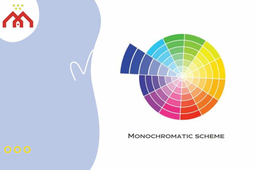
1. Monochromatic Colour Schemes

A monochromatic colour scheme is one of the simplest yet most effective ways to create a harmonious and visually appealing space. This colour scheme is based on the principle of using various shades, tints, and tones of a single hue. By utilising a single colour as a base, a monochromatic colour combinations create a cohesive and balanced look that is easy on the eyes.
One of the primary benefits of a monochromatic colour scheme is its ability to create a sense of unity and harmony within a room. This colour scheme is particularly useful in small spaces, making the area appear larger and more open. Additionally, a monochromatic colour scheme can be an excellent backdrop for showcasing statement pieces, artwork, or bold patterns.
A monochromatic colour combinations is versatile and can be applied to various spaces within the home, including living rooms, bedrooms, and even bathrooms. It is also suitable for different interior design styles, such as minimalist, contemporary, or traditional, allowing for a wide range of creative possibilities.
Tips for creating a monochromatic look
- Select a base colour: To create a monochromatic look in your home, start by selecting a base colour that speaks to your personal style and the overall mood you want to achieve in the space. Consider the psychological impact of the chosen colour, as different hues can evoke different emotions and atmospheres.
- Choose shades, tints, and tones: Next, choose lighter tints and darker shades of the base colour to create depth and dimension. Experiment with various combinations and proportions of these colours to achieve the desired look and feel.
- Incorporate texture and pattern: To add visual interest and prevent the space from looking flat or monotonous, incorporate different textures, patterns, and materials into the design. This can include textiles, such as cushions and curtains, and decorative accents, such as rugs and artwork.
- Balance with neutrals: Introducing subtle neutral elements like white or grey can help balance the monochromatic palette and ensure the space feels inviting and comfortable.
- Pay attention to lighting: How a colour appears can be significantly influenced by the space’s lighting type. Make sure to consider both natural and artificial lighting sources when planning your monochromatic colour scheme, as they can impact the overall appearance and mood of the room.
By following these tips, you can create a visually stunning and harmonious monochromatic look in your home, unlocking the power of colour to transform your living spaces
2. Analogous Colour Scheme
An analogous colour scheme is based on the principle of using colours that are adjacent to each other on the colour wheel. Typically, this colour scheme selects a primary colour and two to four neighbouring hues. By using colours that are closely related, an analogous colour combination creates a harmonious and visually appealing look that offers more variety than a monochromatic scheme.
One of the primary benefits of an analogous colour scheme is its ability to create a sense of balance and harmony while incorporating a wider range of hues. This colour scheme is particularly effective in establishing a specific mood or atmosphere, as the closely related colours can work together to evoke a cohesive and unified feeling.
An analogous colour scheme can be applied to various spaces within the home, including living rooms, bedrooms, and dining areas. It is suitable for different interior design styles, from modern and minimalist to traditional and eclectic, providing numerous opportunities for creative expression.
Tips for creating an analogous look
- Choose a dominant colour: Start by selecting a dominant colour that will serve as the primary focus of your analogous colour scheme. This colour should reflect your personal style and the desired mood for the space.
- Select adjacent hues: Next, choose two to four neighbouring hues on the colour wheel that complement the dominant colour. These colours will serve as secondary and accent colours in the space, adding variety and visual interest to the design.
- Consider colour saturation: When selecting colours for an analogous scheme, consider the saturation levels of each hue. Choosing colours with similar saturation levels can help create a more cohesive and harmonious look, while varying the saturation levels can add depth and contrast to the design.
- Balance with neutrals: Incorporate neutral elements, such as white, grey, or beige, to balance the colour palette and prevent the space from feeling overwhelming or visually chaotic.
- Experiment with patterns and textures: To add visual interest and dimension to an analogous colour combination, incorporate various patterns, textures, and materials into the design. This can include textiles, such as cushions and curtains, as well as decorative accents, such as rugs and artwork.
By following these tips, you can create a visually appealing and harmonious analogous look in your home, harnessing the power of colour to transform your living spaces and create a captivating atmosphere.
3. Complementary Colour Scheme
A complementary colour scheme is based on the principle of using colours that are opposite each other on the colour wheel. This colour scheme typically involves selecting two contrasting colours, such as blue and orange or red and green, to create a bold and visually striking look. By pairing colours that contrast strongly with each other, a complementary colour scheme can create a sense of balance and excitement in a space.
One of the primary benefits of a complementary colour combination is its ability to create a vibrant and dynamic atmosphere. The contrast between the two opposing colours can add visual interest and energy to a room, making it an excellent choice for spaces where you want to make a bold statement or create a lively environment.
A complementary colour scheme can be applied to various spaces within the home, including living rooms, bedrooms, and entryways. It is suitable for different interior design styles, from contemporary and eclectic to traditional and transitional, offering a wide range of creative possibilities.
Tips for creating a complementary look
- Choose contrasting colours: Start by selecting two colours that are opposite each other on the colour wheel. These contrasting colours will serve as the foundation of your complementary colour scheme and should reflect your personal style and the desired mood for the space.
- Balance the intensity: To create a harmonious and balanced look, consider the intensity of the chosen colours. If one colour is particularly bold or dominant, consider using a more subdued version of the opposing colour to maintain balance in the space.
- Incorporate neutral elements: Introduce neutral colours, such as white, grey, or beige, to help balance the vibrant and contrasting hues in your complementary colour scheme. Neutrals can provide a sense of calm and stability, preventing the space from feeling overwhelming or visually chaotic.
- Use colour proportions wisely: Experiment with different proportions of the two contrasting colours to achieve the desired look and feel. For instance, you may choose to use one colour as the dominant hue and the other as an accent colour, or you may opt for a more equal distribution of both colours throughout the space.
- Add textures and patterns: To enhance the visual interest and depth of a complementary colour system, incorporate various textures, patterns, and materials into the design. This can include textiles, such as cushions and curtains, as well as decorative accents, such as rugs and artwork.
By following these tips, you can create a visually striking and energetic complementary look in your home, tapping into the power of colour to transform your living spaces and make a bold statement.
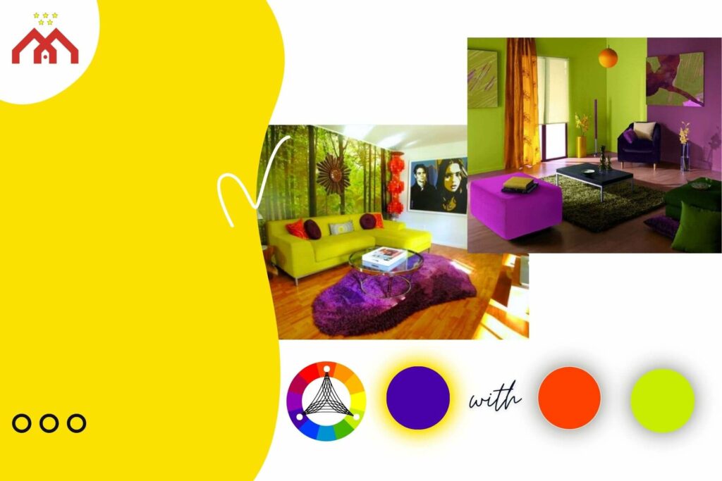
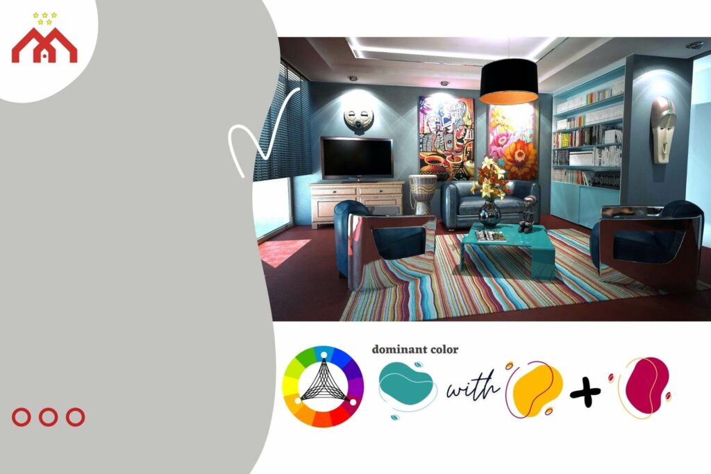
4. Split-Complementary Colour Scheme
A split-complementary colour scheme is a variation of the complementary colour scheme. Instead of using two colours that are directly opposite each other on the colour wheel, this scheme involves selecting one base colour and then pairing it with the two colours that are adjacent to its complement. This creates a visually appealing balance between contrast and harmony, resulting in a striking yet more subdued look compared to a traditional complementary colour scheme.
One of the primary benefits of a split-complementary colour scheme is its ability to create visual interest and contrast while maintaining a sense of harmony and balance. This colour scheme is less intense than a traditional complementary scheme, making it an excellent choice for those who desire a more subtle yet still dynamic look in their living spaces.
A split-complementary colour scheme can be applied to various spaces within the home, including living rooms, bedrooms, and dining areas. It is suitable for different interior design styles, from modern and minimalist to traditional and eclectic, offering numerous opportunities for creative expression.
Tips for creating a split-complementary look
- Select a base colour: Begin by choosing a base colour that reflects your personal style and the desired mood for the space. This colour will serve as the foundation of your split-complementary colour system.
- Identify adjacent complements: Next, find the complement of your base colour on the colour wheel, and then select the two colours that are adjacent to it. These colours will work together with the base colour to create a visually appealing balance between contrast and harmony.
- Balance colour proportions: Experiment with different proportions of the base colour and the two adjacent complements to achieve the desired look and feel. You may choose to use one colour as the dominant hue and the other two as accent colours, or you may opt for a more equal distribution of all three colours throughout the space.
- Incorporate neutral elements: Introduce neutral colours, such as white, grey, or beige, to help balance the vibrant hues in your split-complementary colour scheme. Neutrals can provide a sense of calm and stability, preventing the space from feeling overwhelming or visually chaotic.
- Add textures and patterns: To enhance the visual interest and depth of a split-complementary colour scheme, incorporate various textures, patterns, and materials into the design. This can include textiles, such as cushions and curtains, as well as decorative accents, such as rugs and artwork.
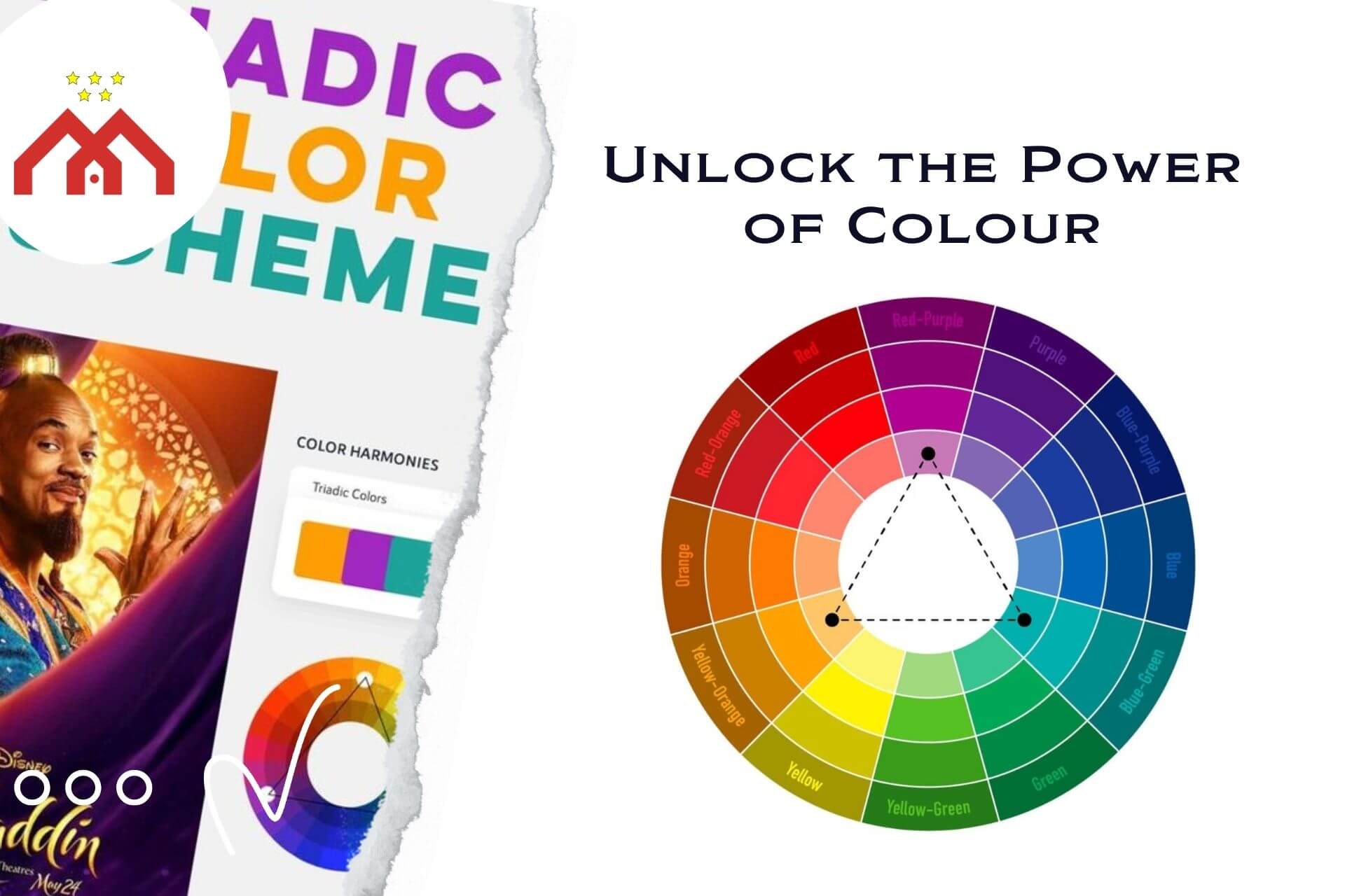
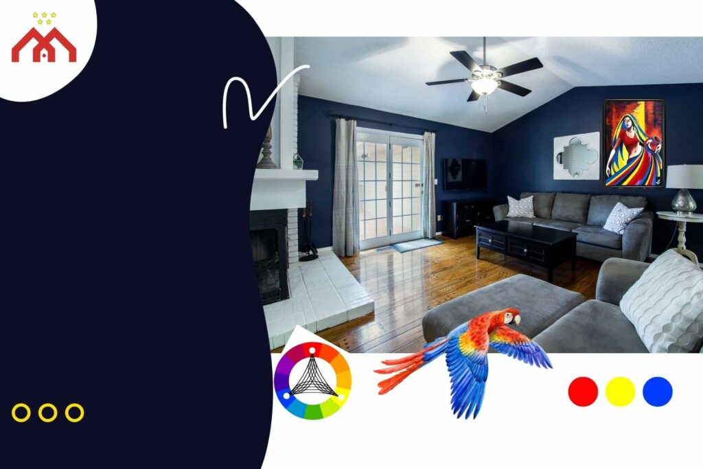
5. Triadic Colour Scheme
A triadic colour scheme is based on the principle of using three colours that are evenly spaced around the colour wheel. This colour scheme creates a vibrant and dynamic look, as it incorporates a wider range of hues that offer both contrast and harmony. By selecting three distinct colours, a triadic colour theme can add visual interest and energy to a space.
One of the primary benefits of a triadic colour scheme is its ability to create a lively and energetic atmosphere. The combination of three distinct colours can add visual interest and excitement to a room, making it an excellent choice for spaces where you want to make a bold statement or create a stimulating environment.
A triadic colour scheme can be applied to various spaces within the home, including living rooms, bedrooms, and entryways. It is suitable for different interior design styles, from contemporary and eclectic to traditional and transitional, offering a wide range of creative possibilities.
Tips for creating a triadic look
- Choose three colours: Start by selecting three colours that are evenly spaced around the colour wheel. These colours will serve as the foundation of your triadic colour scheme and should reflect your personal style and the desired mood for the space.
- Balance colour proportions: Experiment with different proportions of the three colours to achieve the desired look and feel. You may choose to use one colour as the dominant hue and the other two as accent colours, or you may opt for a more equal distribution of all three colours throughout the space.
- Consider colour saturation: When selecting colours for a triadic scheme, consider the saturation levels of each hue. Choosing colours with similar saturation levels can help create a more cohesive and harmonious look, while varying the saturation levels can add depth and contrast to the design.
- Incorporate neutral elements: Introduce neutral colours, such as white, grey, or beige, to help balance the vibrant hues in your triadic colour pattern. Neutrals can provide a sense of calm and stability, preventing the space from feeling overwhelming or visually chaotic.
- Add textures and patterns: To enhance the visual interest and depth of a triadic colour scheme, incorporate various textures, patterns, and materials into the design. This can include textiles, such as cushions and curtains, as well as decorative accents, such as rugs and artwork.
By following these tips, you can create a visually striking and energetic triadic look in your home, tapping into the power of colour to transform your living spaces and make a bold statement. Embrace the potential of triadic colour schemes and unlock their exciting possibilities for creating dynamic, engaging, and visually captivating environments.
6. Tetradic Colour Scheme
A tetradic colour scheme, also known as a double complementary or rectangular colour scheme, is based on the principle of using four colours that are arranged into two complementary pairs on the colour wheel. This colour combination creates a rich and diverse look, as it incorporates a wide range of hues that offer both contrast and harmony. By selecting four distinct colours, a tetradic colour scheme can add visual interest, depth, and energy to a space.
One of the primary benefits of a tetradic colour scheme is its ability to create a complex and engaging atmosphere. The combination of four distinct colours provides a wide range of creative possibilities, making it an excellent choice for spaces where you want to make a bold statement or experiment with various colour combinations.
A tetradic colour scheme can be applied to various spaces within the home, including living rooms, bedrooms, and dining areas. It is suitable for different interior design styles, from contemporary and eclectic to traditional and transitional, offering a wide range of creative possibilities.
Tips for creating a tetradic look
- Choose two complementary pairs: Start by selecting two pairs of complementary colours on the colour wheel. These pairs will serve as the foundation of your tetradic colour theme and should reflect your personal style and the desired mood for the space.
- Balance colour proportions: Experiment with different proportions of the four colours to achieve the desired look and feel. You may choose to use one colour as the dominant hue and the other three as accent colours, or you may opt for a more equal distribution of all four colours throughout the space.
- Consider colour saturation: When selecting colours for a tetradic scheme, consider the saturation levels of each hue. Choosing colours with similar saturation levels can help create a more cohesive and harmonious look, while varying the saturation levels can add depth and contrast to the design.
- Incorporate neutral elements: Introduce neutral colours, such as white, grey, or beige, to help balance the vibrant hues in your tetradic colour scheme. Neutrals can provide a sense of calm and stability, preventing the space from feeling overwhelming or visually chaotic.
- Add textures and patterns: To enhance the visual interest and depth of a tetradic colour scheme, incorporate various textures, patterns, and materials into the design. This can include textiles, such as cushions and curtains, as well as decorative accents, such as rugs and artwork.
By following these tips, you can create a visually striking and engaging tetradic look in your home, unlocking the power of colour to transform your living spaces and make a bold statement. Embrace the potential of tetradic colour schemes and unlock their exciting possibilities for creating dynamic, engaging, and visually captivating environments.
7. Neutral Colour Scheme
A neutral colour scheme is based on the principle of using colours that are considered to be neither warm nor cool, such as white, grey, beige, and other earth tones. This colour scheme creates a calm and soothing atmosphere, incorporating a range of muted hues that offer a sense of balance and harmony. By selecting various neutral colours, a neutral colour scheme can add visual interest and depth to a space while maintaining an overall sense of tranquillity and serenity.
One of the primary benefits of a neutral colour theme is its ability to create a calm and inviting atmosphere. Muted hues provide a sense of balance and harmony, making it an excellent choice for spaces where you want to promote relaxation and tranquillity, such as bedrooms and living rooms.
A neutral colour scheme can be applied to various spaces within the home, including living rooms, bedrooms, and dining areas. It is suitable for different interior design styles, from contemporary and minimalist to traditional and transitional, offering a wide range of creative possibilities.
Tips for creating a neutral look
- Choose various neutral colours: Begin by selecting a range of neutral colours, such as white, grey, beige, and other earth tones. These colours will serve as the foundation of your neutral colour scheme and should reflect your personal style and the desired mood for the space.
- Balance colour proportions: Experiment with different proportions of the various neutral colours to achieve the desired look and feel. You may choose to use one colour as the dominant hue and the others as accent colours, or you may opt for a more equal distribution of all the neutral colours throughout the space.
- Add depth with shades and tints: To create visual interest and depth in a neutral colour combination, incorporate different shades and tints of the selected neutral colours. This can help to create a sense of dimension and prevent the space from feeling flat or monotonous.
- Incorporate textures and patterns: Enhance the visual interest and depth of a neutral colour scheme by incorporating various textures, patterns, and materials into the design. This can include textiles, such as cushions and curtains, as well as decorative accents, such as rugs and artwork.
- Use pops of colour: To add a touch of visual interest and excitement to a neutral colour scheme, consider incorporating small accents of more vibrant colours. These pops of colour can help draw the eye and add a sense of personality and flair to the space without overwhelming the serene atmosphere.
- Layer different neutrals: Introduce different layers of neutrals in your design to create a sense of depth and sophistication. For instance, you can use a lighter neutral shade for the walls, a slightly darker neutral for the furniture, and then play with various neutral tones in your accessories and textiles.
- Use metallic accents: To add a touch of luxury and elegance to your neutral colour scheme, consider incorporating metallic accents, such as gold, silver, or brass. These accents can help to elevate the overall aesthetic and create a sense of richness and refinement within the space.
By following these tips, you can create a visually appealing and calming neutral look in your home, tapping into the power of colour to transform your living spaces and promote a sense of relaxation and tranquillity. Embrace the potential of neutral colour schemes and unlock the possibilities they offer for creating serene, inviting, and visually captivating environments.
Warm Colour Scheme
A warm colour scheme is based on the principle of using colours that are associated with warmth, such as red, orange, and yellow. These colours evoke feelings of energy, passion, and coziness, creating an inviting and comfortable atmosphere in the space. By selecting a variety of warm colours, a warm colour scheme can add visual interest, depth, and warmth to a space, making it feel more welcoming and appealing.
One of the primary benefits of a warm colour scheme is its ability to create a cozy and inviting atmosphere. The use of warm hues provides a sense of comfort and warmth, making it an excellent choice for spaces where you want to promote relaxation and socialization, such as living rooms, dining rooms, and kitchens.
A warm colour scheme can be applied to various spaces within the home, including living rooms, bedrooms, and dining areas. It is suitable for different interior design styles, from contemporary and eclectic to traditional and transitional, offering a wide range of creative possibilities.
Tips for creating a warm look
- Choose a variety of warm colours: Begin by selecting a range of warm colours, such as red, orange, and yellow. These colours will serve as the foundation of your warm colour scheme and should reflect your personal style and the desired mood for the space.
- Balance colour proportions: Experiment with different proportions of the various warm colours to achieve the desired look and feel. You may choose to use one colour as the dominant hue and the others as accent colours, or you may opt for a more equal distribution of all the warm colours throughout the space.
- Add depth with shades and tints: To create visual interest and depth in a warm colour scheme, incorporate different shades and tints of the selected warm colours. This can help to create a sense of dimension and prevent the space from feeling flat or monotonous.
- Incorporate textures and patterns: Enhance the visual interest and depth of a warm colour scheme by incorporating various textures, patterns, and materials into the design. This can include textiles, such as cushions and curtains, as well as decorative accents, such as rugs and artwork.
- Use neutral elements: To balance the vibrancy of the warm colours, consider incorporating neutral elements into the design. This can include furniture, flooring, or wall treatments in shades of white, beige, or grey, which can help to ground the space and prevent it from feeling overwhelming.
- Consider lighting: The right lighting can enhance the warmth and coziness of a warm colour scheme. Opt for soft, ambient lighting, such as table lamps and floor lamps, as well as warm, dimmable overhead lighting to create a comfortable and inviting atmosphere.
- Add natural elements: To further enhance the warmth of the space, consider incorporating natural elements, such as wooden furniture, plants, and natural fibres like jute or sisal. These elements can help to create a sense of connection to nature and promote a feeling of warmth and comfort.
By following these tips, you can create a visually appealing and inviting warm look in your home, tapping into the power of colour to transform your living spaces and promote a sense of relaxation, warmth, and coziness. Embrace the potential of warm colour schemes and unlock their possibilities for creating inviting, comfortable, and visually captivating environments.
Cool Colour Scheme
A cool colour scheme is based on the principle of using colours that are associated with coolness, such as blue, green, and violet. These colours evoke feelings of calm, tranquility, and freshness, creating a soothing and peaceful atmosphere in the space. By selecting a variety of cool colours, a cool colour scheme can add visual interest, depth, and a sense of serenity to a space, making it feel more relaxing and harmonious.
One of the primary benefits of a cool colour scheme is its ability to create a calm and soothing atmosphere. Cool hues provide a sense of relaxation and harmony, making it an excellent choice for spaces where you want to promote a peaceful and tranquil environment, such as bedrooms, bathrooms, and home offices.
A cool colour scheme can be applied to various spaces within the home, including living rooms, bedrooms, and dining areas. It is suitable for different interior design styles, from contemporary and minimalist to traditional and transitional, offering a wide range of creative possibilities.
Tips for creating a cool look
- Choose a variety of cool colours: Begin by selecting a range of cool colours, such as blue, green, and violet. These colours will serve as the foundation of your cool colour scheme and should reflect your personal style and the desired mood for the space.
- Balance colour proportions: Experiment with different proportions of the various cool colours to achieve the desired look and feel. You may choose to use one colour as the dominant hue and the others as accent colours, or you may opt for a more equal distribution of all the cool colours throughout the space.
- Add depth with shades and tints: To create visual interest and depth in a cool colour scheme, incorporate different shades and tints of the selected cool colours. This can help to create a sense of dimension and prevent the space from feeling flat or monotonous.
- Incorporate textures and patterns: Enhance the visual interest and depth of a cool colour scheme by incorporating various textures, patterns, and materials into the design. This can include textiles, such as cushions and curtains, as well as decorative accents, such as rugs and artwork.
- Use neutral elements: To balance the vibrancy of the cool colours, consider incorporating neutral elements into the design. This can include furniture, flooring, or wall treatments in shades of white, beige, or grey, which can help to ground the space and prevent it from feeling overwhelming.
- Consider lighting: The right lighting can enhance the soothing and calming atmosphere of a cool colour scheme. Opt for soft, ambient lighting, such as table lamps and floor lamps, as well as cool, dimmable overhead lighting to create a serene and tranquil environment.
- Add natural elements: To further enhance the serenity of the space, consider incorporating natural elements, such as wooden furniture, plants, and natural fibres like linen or cotton. These elements can help to create a sense of connection to nature and promote a feeling of calm and relaxation.
By following these tips, you can create a visually appealing and soothing cool look in your home, tapping into the power of colour to transform your living spaces and promote a sense of relaxation, tranquility, and harmony. Embrace the potential of cool colour schemes and unlock the possibilities they offer for creating calming, serene, and visually captivating environments.
10. Accented Neutral Colour Scheme
An accented neutral colour scheme is based on the principle of using primarily neutral colours, such as white, grey, beige, and other earth tones, and adding small accents of more vibrant colours to create visual interest and depth. This colour scheme offers the best of both worlds: the calming and harmonious effect of neutrals and the energy and personality of accent colours. By carefully selecting and incorporating accent colours, an accented neutral colour scheme can create a balanced, visually appealing space that feels both serene and dynamic.
One of the primary benefits of an accented neutral colour scheme is its versatility. The use of neutral hues as the foundation of the design allows for a wide range of accent colours, making it easy to adapt the scheme to various styles, tastes, and preferences. This colour scheme is also an excellent choice for spaces where you want to create a sense of balance and harmony while also adding a touch of personality and flair.
An accented neutral colour scheme can be applied to various spaces within the home, including living rooms, bedrooms, and dining areas. It is suitable for different interior design styles, from contemporary and minimalist to traditional and transitional, offering a wide range of creative possibilities.
Tips for creating an accented neutral look
- Choose a variety of neutral colours: Begin by selecting a range of neutral colours, such as white, grey, beige, and other earth tones. These colours will serve as the foundation of your accented neutral colour scheme and should reflect your personal style and the desired mood for the space.
- Select accent colours: Choose one or more accent colours to complement the neutral hues in your colour scheme. These accent colours can be bold and vibrant or more subdued, depending on your personal preferences and the desired effect.
- Balance colour proportions: Experiment with different proportions of the neutral and accent colours to achieve the desired look and feel. You may choose to use one accent colour as the primary focal point, with the neutral colours serving as the backdrop, or you may opt for a more equal distribution of the accent and neutral colours throughout the space.
- Incorporate textures and patterns: Enhance the visual interest and depth of an accented neutral colour scheme by incorporating various textures, patterns, and materials into the design. This can include textiles, such as cushions and curtains, as well as decorative accents, such as rugs and artwork.
- Use accent colours strategically: To create a cohesive and balanced look, be strategic in how you incorporate accent colours into the space. Use them sparingly and intentionally to draw the eye to specific areas, such as an accent wall, a piece of artwork, or a statement piece of furniture.
- Consider lighting: The right lighting can enhance the overall atmosphere of an accented neutral colour scheme. Opt for soft, ambient lighting, such as table lamps and floor lamps, as well as adjustable, dimmable overhead lighting to create a comfortable and inviting environment.
- Update accents easily: One of the benefits of an accented neutral colour scheme is the ease with which you can update the look of the space. By simply changing the accent colours, you can refresh the room’s appearance without the need for a complete makeover.
By following these tips, you can create a visually appealing and harmonious accented neutral look in your home, tapping into the power of colour to transform your living spaces and promote a sense of balance, serenity, and personality. Embrace the potential of accented neutral colour schemes and unlock the possibilities they offer for creating inviting, comfortable, and visually captivating environments.
Conclusion
In this article, we have explored 10 must-know colour schemes for a stunning home makeover:
- Monochromatic Colour Scheme
- Analogous Colour Scheme
- Complementary Colour Scheme
- Split-Complementary Colour Scheme
- Triadic Colour Scheme
- Tetradic Colour Scheme
- Neutral Colour Scheme
- Warm Colour Scheme
- Cool Colour Scheme
- Accented Neutral Colour Scheme
Each of these colour schemes offers unique benefits and can be adapted to suit various interior design styles, preferences, and desired atmospheres.
As you consider the options available to you, don’t be afraid to experiment with different colour schemes to find the perfect balance for your space. Remember that your home should reflect your personal style and taste, and the right colour scheme can help you achieve a cohesive and visually appealing environment that feels both inviting and comfortable. By trying out various combinations of colours and proportions, you can unlock the full potential of colour in your home and create a truly stunning makeover.
In conclusion, the power of colour in interior design cannot be overstated. The right colour scheme can transform a living space, evoke specific emotions, and create a harmonious and visually captivating environment. By understanding and applying these 10 must-know colour schemes, you can unlock the potential of colour in your home and achieve a stunning makeover that reflects your unique style and personality.
So explore the world of colour, and let your creativity shine. Embrace the power of colour to create a home that is beautiful andtion of you and your personal style.